| This is a child page. You can use Parent in the quick nav bar at the top or the bottom of the page to navigate directly back to the parent of this page. Some child pages are more than one level deep, and in that case will require more than one Parent click to reach the outermost document level. |
§ 25.8 - Glass Effects Tutorial
§ 25.8.1 - Relief effects on glass balls
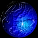
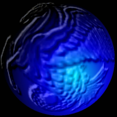
To do this tutorial, you'll need the first two images shown below; the blue ball and the relief image. Or, you can make a ball yourself, and for that matter, you can create your own relief image...
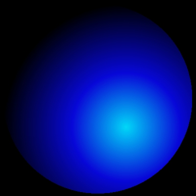
This is a 400x400 black base image, with a Concentric Fill pattern fill where the palette was set to black, fading to dark blue, then to light blue, with parameters:
- cycle=0
- xbias=30
- ybias=-30
- smooth checked
The area used was an Ellipse, with the Hold Square option selected in the Toolbox (to keep the fill round).
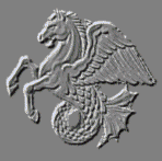
This is the output of the Relief operation, where the background color is exactly 128,128,128 or the middle grey value. That's important - if the background isn't set to 128,128,128, this will not work! You can use any image that produces a suitable relief result... it should look nicely etched. This image came from Greg Tsalidas.
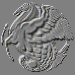
Next, we use the Geom/Dome operation set to 200 with the Entire Image area select on the Relief image. This warps it into a shape that is contoured to match the "ball" look we want. You might or might not want to do this for your image, but to put the image on a ball like the one we've created, it's ideal.
Here, we've used the Math/Add Images operation, with the add about gray option selected. The area selection was a Rectangle, with the hold to source option in the Toolbox selected to ensure that the image is not further distorted by the placement operation. The source for the operation was the domed Relief image.
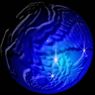
Finally, we used the Lighting/Asterize operation to place some highlights on the image. The 4-star preset was used, with three parameters changed:
- Width=18
- Arms=7
- Center Glow = checked
The asterisms were placed in several locations with various Ellipse area selections.
§ 25.8.2 - Glass Font Tutorial Using Layers
The above technique can be used very well in a layered image, with the additional benefits that the glass effect may be moved about at will. Here's another way to go about making some nice glass effects:
Before you begin, make certain that the menu item options in the Area menu are set as follows:
✓ Antialias Area Selections
✓ Opaque Fills
✓ Mask With target Alpha
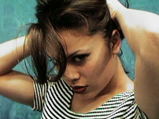
We need a background to work against. We'll use stacey99.jpg, as it's a reasonably complex image and the glass will look good against it to show what we're doing here. So we load up stacey99.jpg and then with the image view active press L to promote it to a layered image; then click OK.
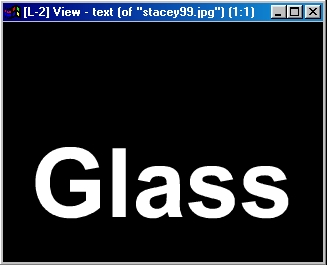
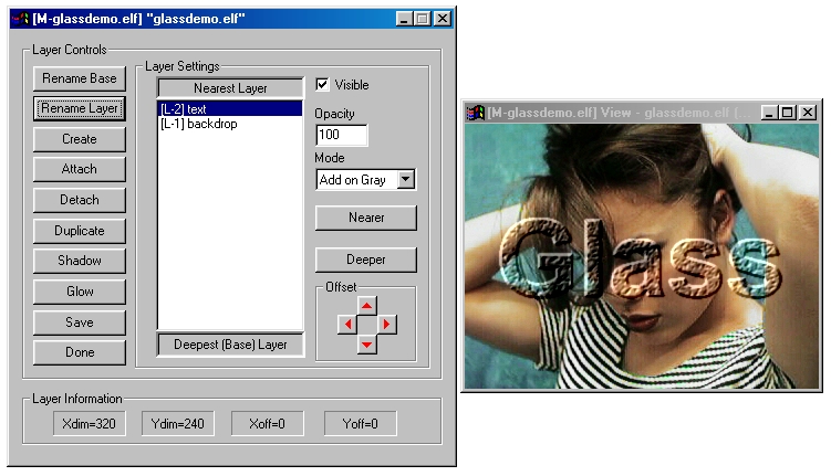
In the Layers dialog itself, click Create to generate a new layer. Now click Nearer to bring it to the top, then Rename Layer and change the name to "Text" just so we can identify the layers easily. Now click Done
Now arrange the image layers so you can work on the Text layer.
We want to fill the layer with black. So select the Standard / Color Fill operation, set the three RGB values all to zero, select the Entire Image Image tool from the Toolbox, and click on the Text layer. It will turn black, and if the alpha display was on, indication of alpha content from the previously transparent image will go away.
Now we need to place some white text in the Text layer. Change the color values in the Color Fill tool from 0, 0, 0 to 255, 255, 255. Now select the Font tool from the Toolbox with the right mouse button and set the font to a Bold Arial of 72 points. This is a pretty hefty font.
Now click in the Layer and type (what else?) "Glass." Now things should look like this:
You could make this right into smooth glass right now, but we're going to "distress" the surface a little bit; there's nothing like texture to add realism.
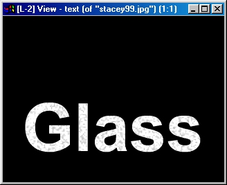
Select the Filter / Dither operation, and set it for a width and height of 2, an amount of 50 and a seed of 4. See that Keep Gray is checked.
Now, using the Color Wand from the Toolbox (right click it and be sure the RGB tolerance is selected and set to 0, 0, 0), click on each of the letters in turn. The result looks like this:
Now we're ready to give it some depth. Select the Filter / Relief operation, set it for a depth of 8, select the Entire Image Image tool from the Toolbox and click on the Text layer. Looks interesting!
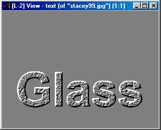
Finally, open the Layers dialog (press L or use the view's context menu Layer item), select the Text Layer and change its Mode to Add on Gray. Here's what you should see:
The final result should look pretty much like this...
(except the text layer is positioned differently in this saved version)
You can do some additional things like Blur the results of the Relief operation, change the Dither size and intensity (or leave it out altogether), use Remap or some other geometic operation to distort the text... the possibilities are truly endless.
, Previous Page . Next Page t TOC i Index o Operators g Glossary
Copyright © 1992-2007 Black Belt Systems ALL RIGHTS RESERVED Under the Pan-American Conventions
WinImages F/x Manual Version 7, Revision 6, Level A
![]()